AURA Identity
Brand identity · Visual system
The identity of AURA, designed as the voice of the space: the same light, gold and shadow as the interior, translated into a mark and a system a guest can hold. From the logo to the menu, the membership card and the signage, every piece was drawn for production and made in real workshops.
The signature
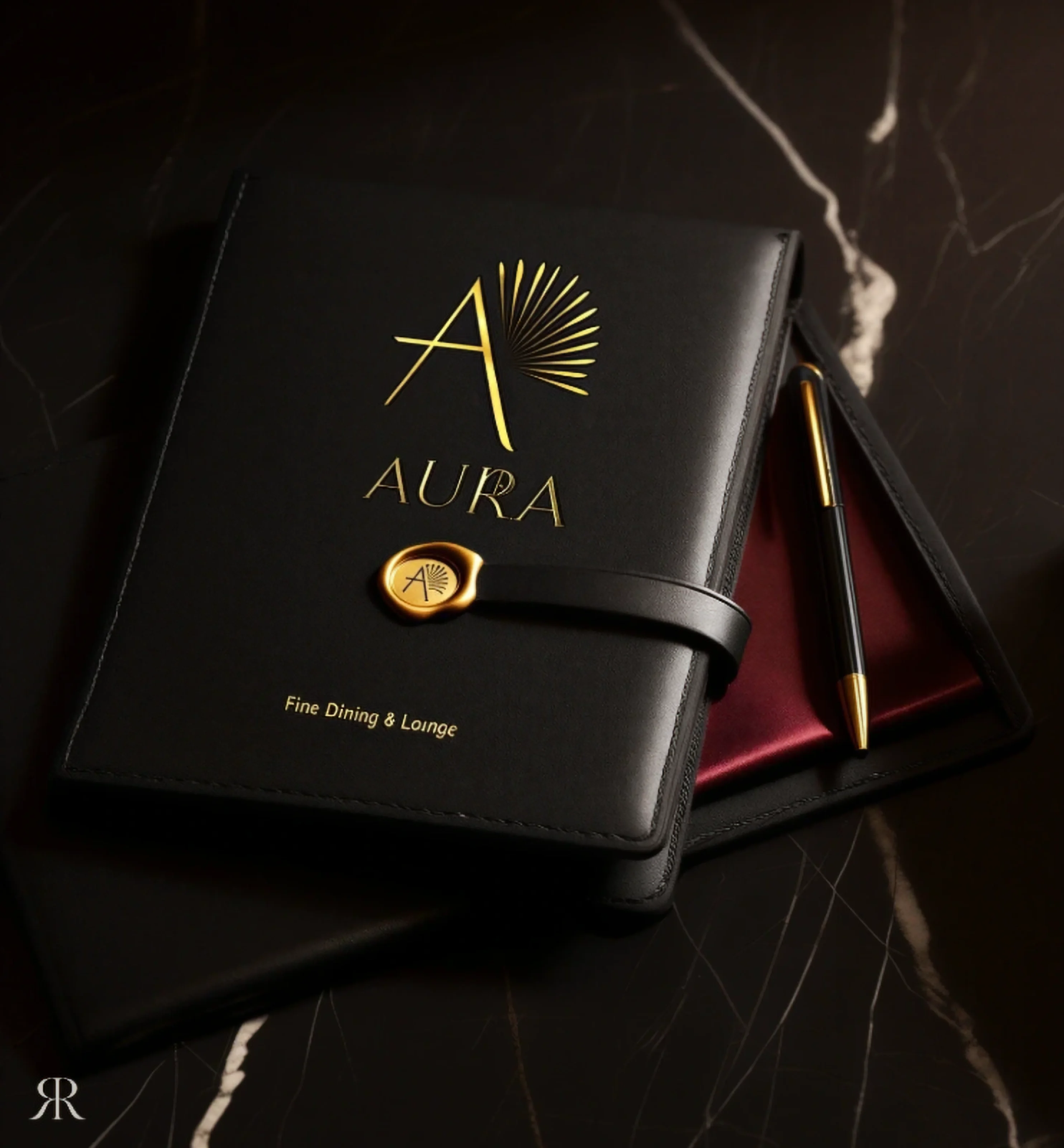
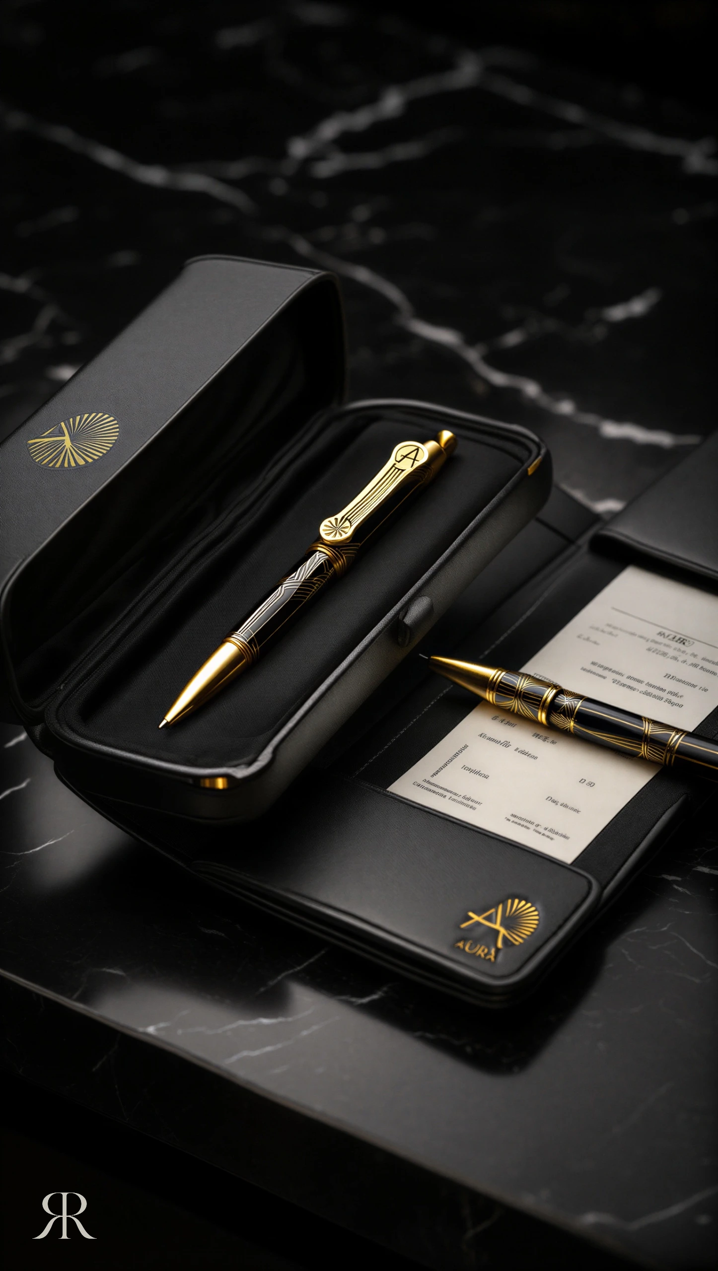
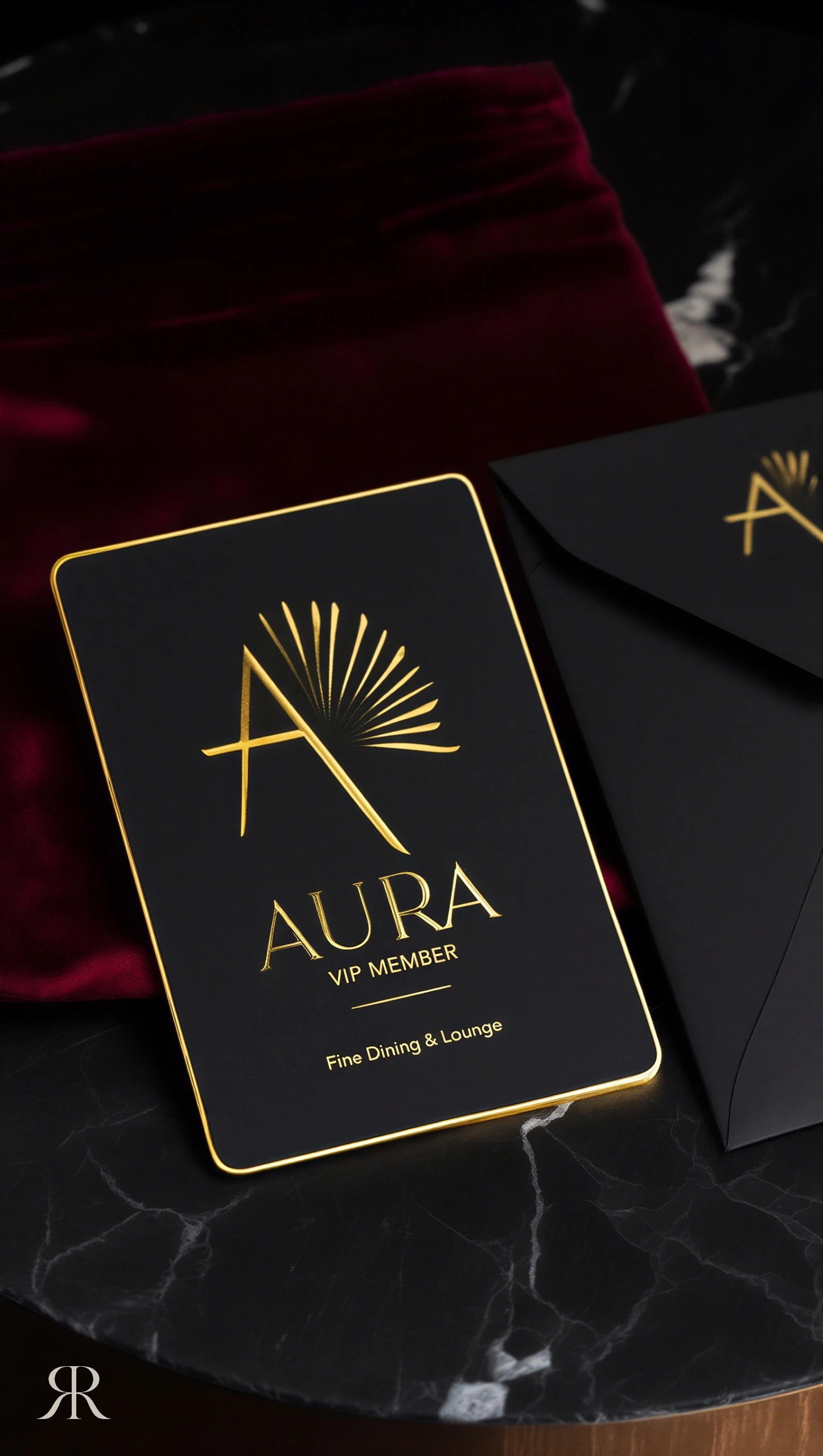
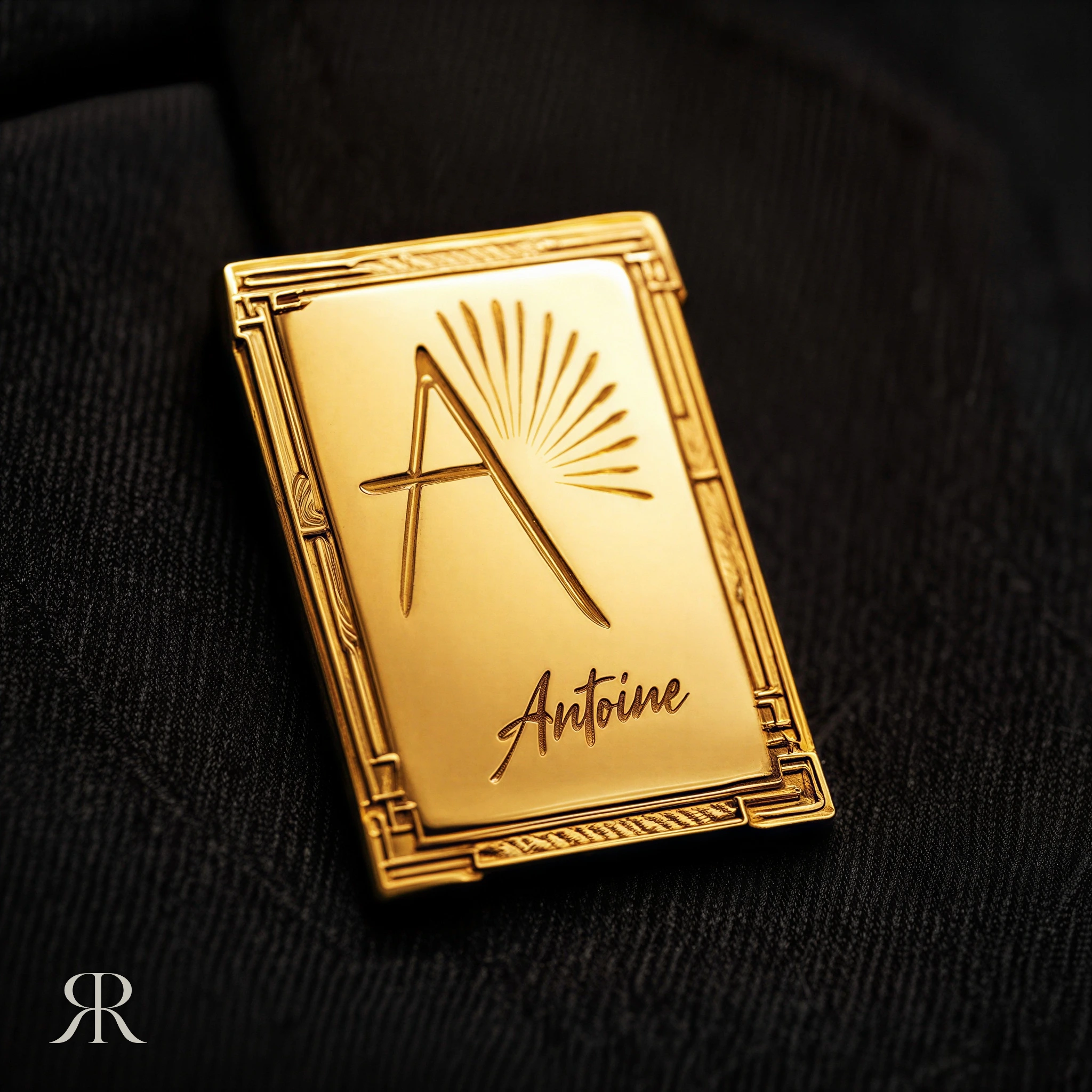
A luxury brand is recognised before it is read. AURA's mark balances sharp lines that speak of structure with fluid curves that recall feathers and rays of light — the same tension between precision and softness that runs through the interior. It is built on strict geometric proportions so it holds its presence at every scale, from the clip of a pen to a building facade. On paper it is foiled, embossed or debossed rather than printed flat, so the signature is felt under the fingertips as much as it is seen.
The gift
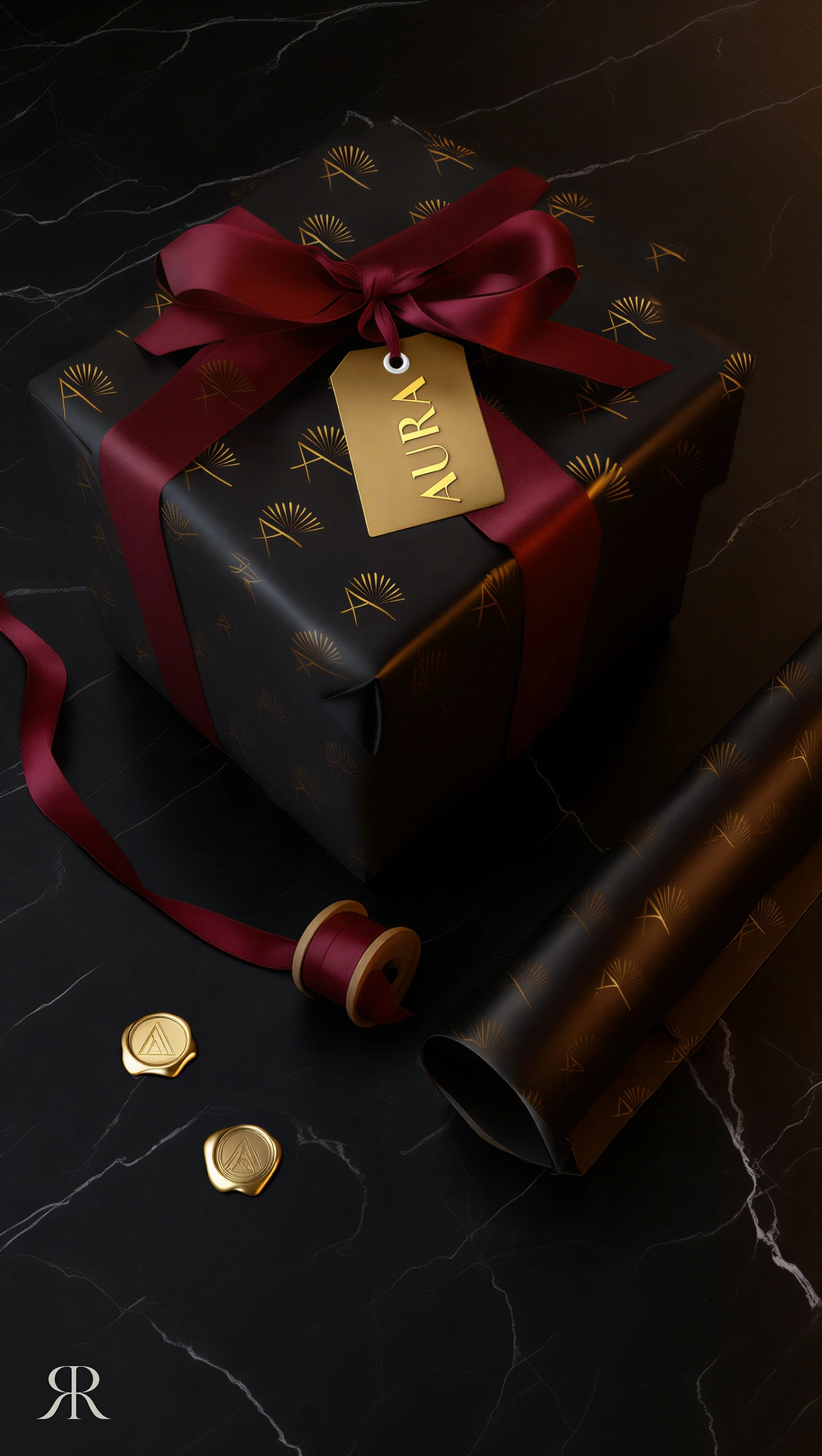
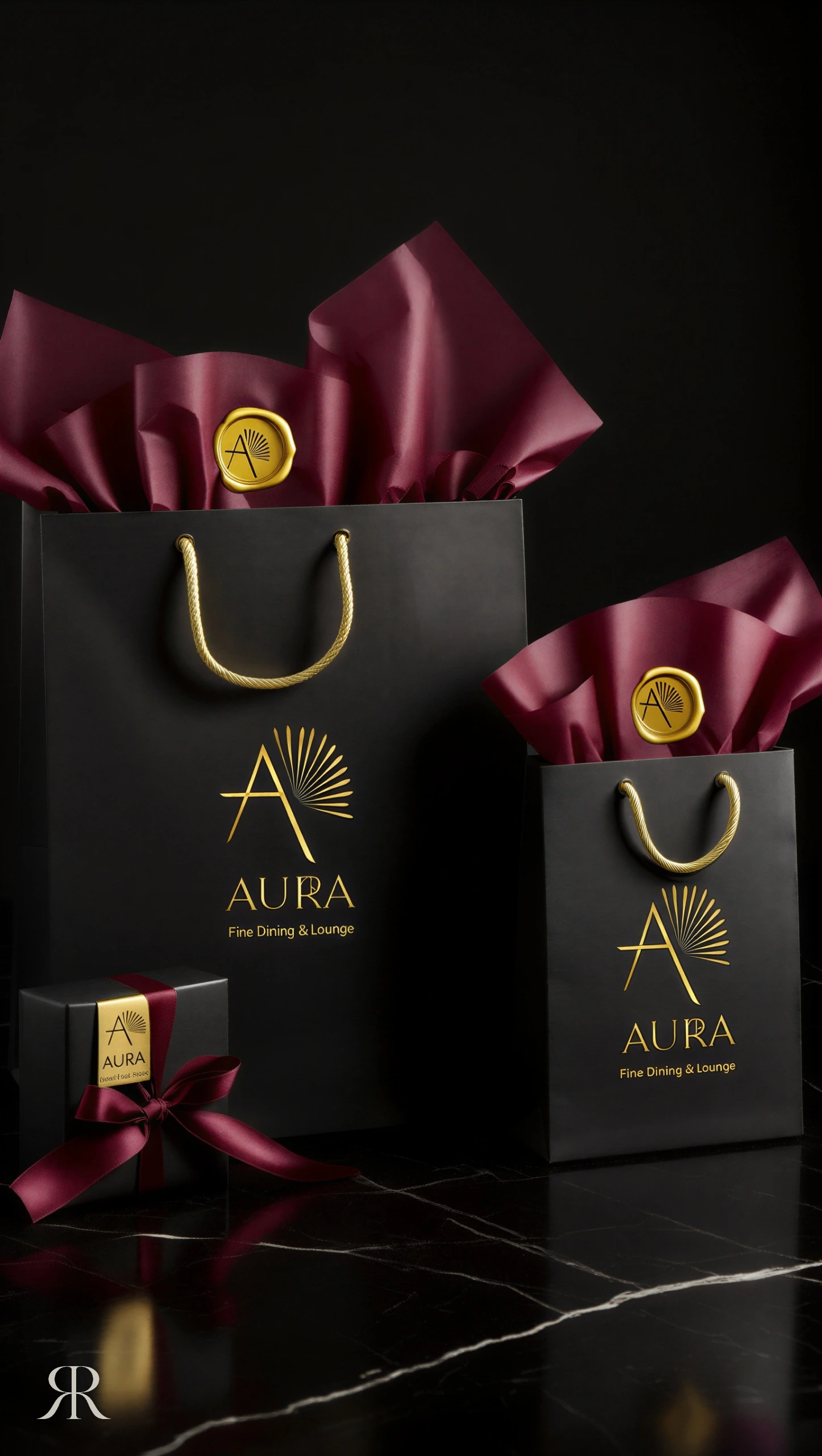
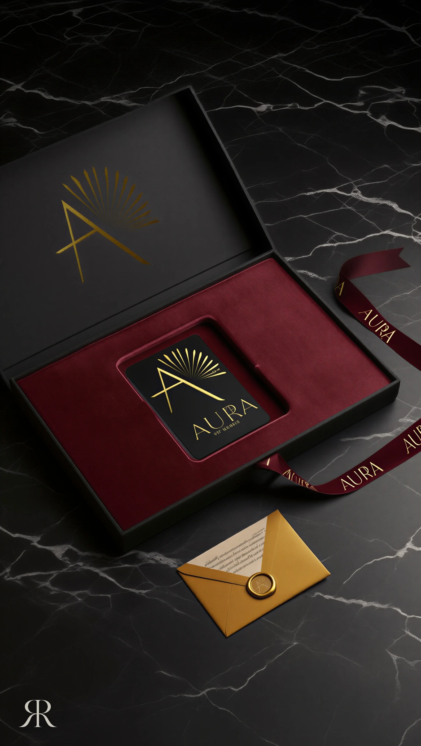
The experience is designed to leave with the guest. Gift boxes, ribbons and shopping bags carry the matte black and gold of the interior out into the street, turning every purchase into a small piece of the place. The packaging is built around the moment of opening — the layers, the weight, the sound of the lid — a slow reveal that repeats the arrival through the gold arch.
The menu
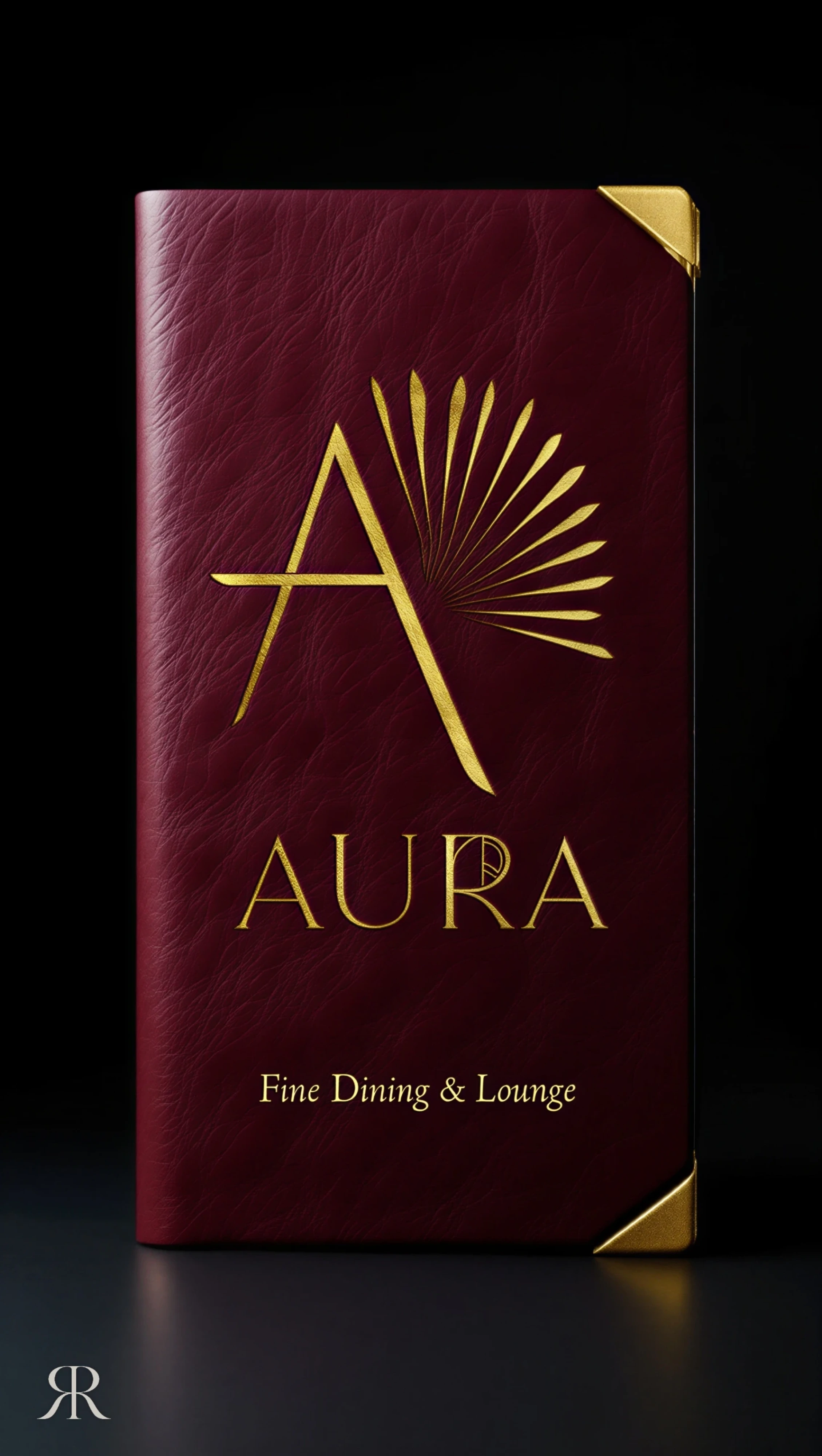
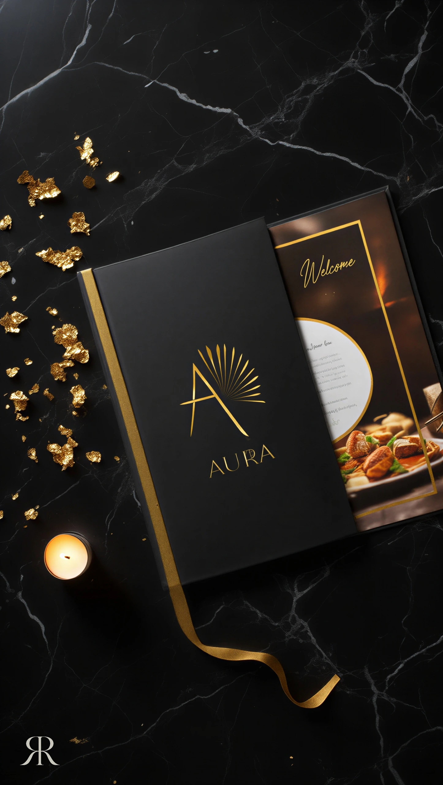
The menu is the object a guest holds the longest, so it was treated as part of the architecture rather than as print. Deep burgundy and black covers echo the velvet and the stone of the dining hall, the mark is set in gold, and the typography is given generous space so it reads easily in low light. Opening the menu is the first quiet moment of the evening, and it should feel as considered as the room around it.
Membership
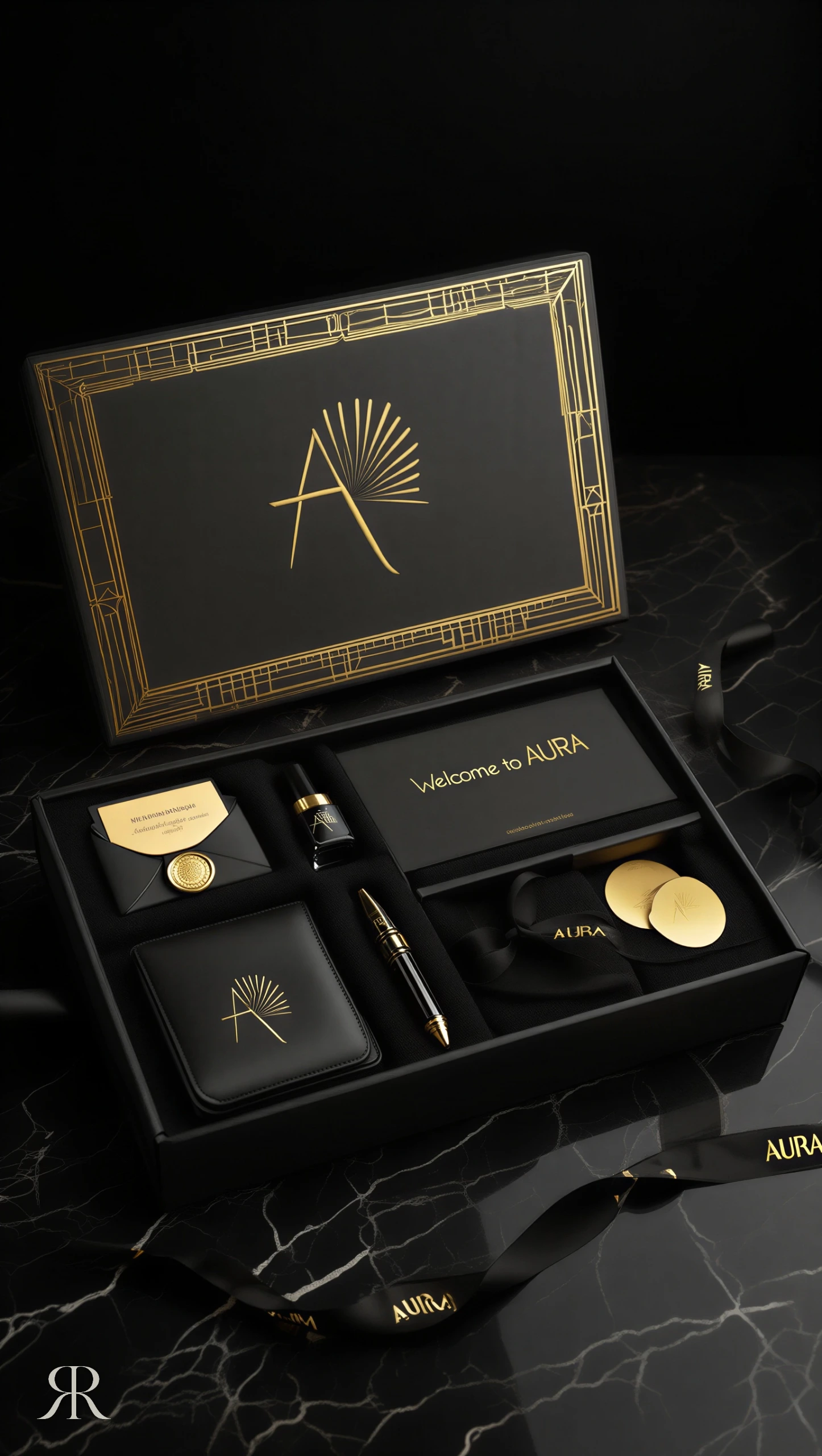
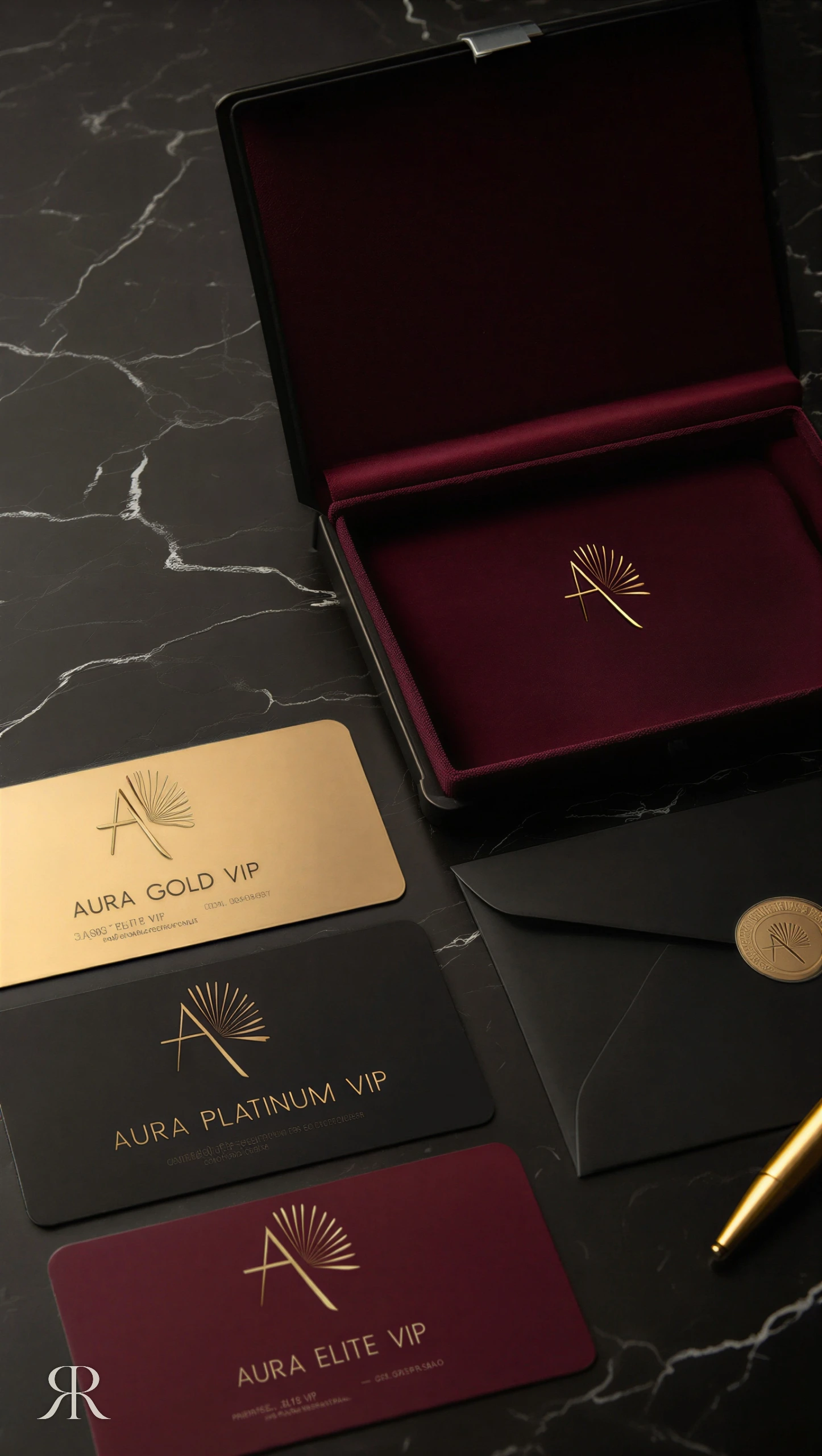
Membership turns a visit into belonging. The card is designed as an object rather than a document — metal, gold and black — presented in a box that opens like a jewellery case. The weight of the card, the precision of its edges and the ritual of receiving it tell the member, before a word is said, that they are part of something kept for few.
The senses
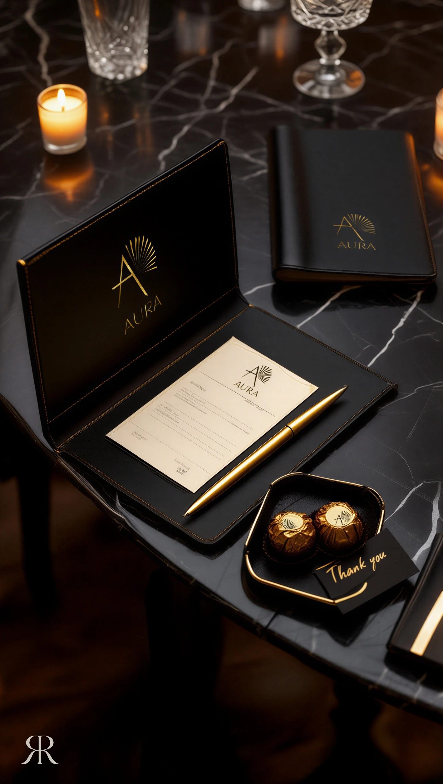
Luxury is completed by the senses a photograph cannot capture. The identity reaches the details a guest touches without thinking: key tags, washroom amenities, barware, cups, chocolates, candles and a signature scent. Each carries the same black and gold, applied with restraint, so the brand is never loud — it is simply everywhere, and AURA is remembered through scent and touch as much as through sight.
Wayfinding
In a dark interior, signage has to guide without breaking the atmosphere. AURA's wayfinding is set on black stone and metal with gold lettering and soft backlighting — readable when it is needed and almost invisible when it is not. It speaks in the same voice as the architecture, so finding your way becomes part of the experience rather than an interruption.
On screen, in the city
Most guests meet AURA on a screen before they meet it in person. The website, the digital menu and the outdoor campaign carry the same darkness, gold and calm as the room, with imagery that sells an atmosphere rather than a product. The first impression and the first visit tell the same story.
From the workshop
An identity is only real once it is made. Every piece was drawn for production and followed into the workshops — foil stamping, engraving, metal plates, leatherwork and hand finishing — through to the installation of the gold letters on site. Materials and gold tones were compared side by side so the gold reads as one colour across paper, metal and leather: the hardest and most important part of any luxury system.
Delivered
The final step is the least glamorous and the most telling: colour references approved, pieces checked one by one, then packed and delivered ready for opening night. A brand system is judged not by how it is presented but by how complete it is on the first day the doors open.